
There’s a specific American design problem that shows up every fall: you need a typeface that works on a jersey, a gym window decal, an Instagram carousel, and a 40-foot arena banner, and it has to still read from the cheap seats.
Most designers default to a condensed gothic and call it done. Fair — condensed gothics are load-bearing infrastructure in American sports design and have been since the first varsity block letter. But “condensed gothic” is a category, not a font, and the specific cut you pick is the difference between looking like a real brand and looking like a Fiverr mockup.
Four picks from Envato Elements, each covering a different job.
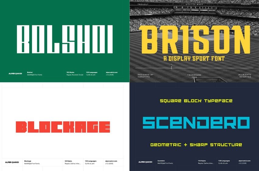
1. Bolshoi Font — the system font for a whole identity
Bolshoi – Bold Gothic Typeface Family
A family, not a single cut. That’s the differentiator, and it’s why you start here if you’re building a brand rather than a one-off poster.
Single-weight display fonts trap you. You design the wordmark, it looks great, then you need a subhead — and now you’re faking hierarchy with size alone because there’s only one weight in the box. A family gives you an actual type scale: heavy for the mark, medium for the subhead, something lighter for the supporting line.
Use it for: full brand identities, kit systems, anything with more than three levels of information.
Check first: type out 0123456789 at large size. Sports work is numbers-heavy — jersey numbers, scores, dates, prices — and plenty of display fonts have gorgeous letters and afterthought digits. Look hard at the 3, the 6, and the 9.
For Commercial Licence Click Here
Try 4 Bold Display Fonts for Sports, Streetwear, and Anything That Needs to Yell
Type your own text to see how it looks before you download.
2. Brison Font — built for athletic branding specifically
Brison – A Display Sport Font
Purpose-built for sport, which saves you the step of bending a general-purpose display face into shape. If you’re doing team identity work on a deadline, this is the fastest route to something that looks intentional rather than assembled.
Use it for: team marks, jersey treatments, tournament branding, gym identities.
Watch for: the caps-only trap. Many sport display faces ship uppercase-dominant or with weak lowercase — fine for a wordmark, a disaster for a subhead. Check the character set on the item page before you build a system around it.
For Commercial Licence Click Here
3. Blockage Font — for headlines that get screenshotted twice
Blockage – Bold Font Family
Heavy weight, high impact, and another family. Where Bolshoi is the structural choice, Blockage is the loud one — a face for headlines that have to survive being posted at 1080×1080, screenshotted, reposted, and compressed twice on the way.
Use it for: social graphics, drop announcements, merch hits, poster work.
Watch for: embroidery. If merch is part of the plan, heavy faces with tight counters fill in on a chest hit at 4 inches wide. Ask your decorator for their minimum stroke width and counter size before you finalize.
For Commercial Licence Click Here
4. Scendero Font — the tech and esports lane
Scendero – Futuristic Typeface Family
Esports, gaming, tech-adjacent fitness. Again a family, so you get range rather than a single novelty cut.
Use it for: gaming orgs, connected-fitness brands, anything positioned as performance tech.
The honest caveat: futuristic faces date faster than any other category in type. A condensed gothic from 1965 still works. A futuristic face from 2015 looks like 2015. If this is going on something with a long shelf life — permanent signage, a five-year brand system — think twice. For a campaign or a single season, go ahead.
For Commercial Licence Click Here
Things that will save you a reprint
Test at 3 feet and at 30. Jersey numbers, window graphics, and trade-show banners get read at distance. Print your candidate at actual size, tape it to a wall, walk backward. Four minutes, and it catches problems no on-screen proof will.
Sublimation and screen print behave differently. A face that holds up screen-printed on a cotton tee can distort on a stretchy sublimated jersey. Get a physical sample before a production run.
Vehicle and window graphics are read in motion. Wide, heavy, high contrast. Anything delicate vanishes.
Check the license against your use. Merch resale, client work, and broadcast use aren’t always treated identically. Read the Elements license terms for the specific item.
Leave a Reply