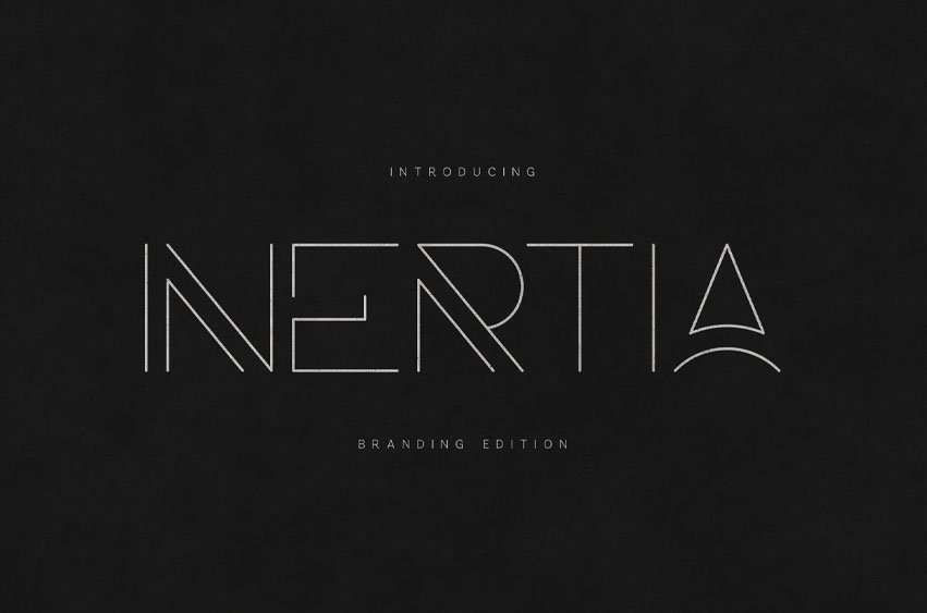
Inertia Font is a refined ultra-thin display typeface built for modern luxury identities and conceptual branding systems.
Defined by precision line weight, architectural geometry, and distinctive letter construction, it delivers an elevated aesthetic that feels both futuristic and timeless.
This is not a body font. This is a statement font.
Minimal in weight. Maximum in presence.
Design Philosophy
Inertia explores tension between structure and space.
Every glyph is constructed with deliberate negative space and controlled stroke rhythm. Select characters feature refined geometric interventions — such as the signature triangular “A” and diagonal internal cuts — creating a subtle but memorable identity system.
The result is a typeface that feels:
• Architectural • Editorial • Experimental • High-end • Concept-driven
Ideal For
Luxury branding Fashion houses Perfume & cosmetics Architecture studios Jewelry brands High-concept editorials Minimal logos Album covers Gallery posters Tech startups
What Makes INERTIA Unique
• Ultra-thin precision stroke • Distinctive geometric A and custom cuts • Balanced spacing for logo usage • Elegant numeric set • Multilingual support • Clean punctuation & symbols • OTF format
This typeface was designed specifically for brand marks, headlines, and identity systems that rely on space, contrast, and subtle sophistication.
Aesthetic Direction
Think:
Black marble backgrounds Silver foil stamping Embossed business cards Luxury packaging Modern museum signage Runway typography
Inertia doesn’t shout. It whispers with confidence.


Leave a Reply