
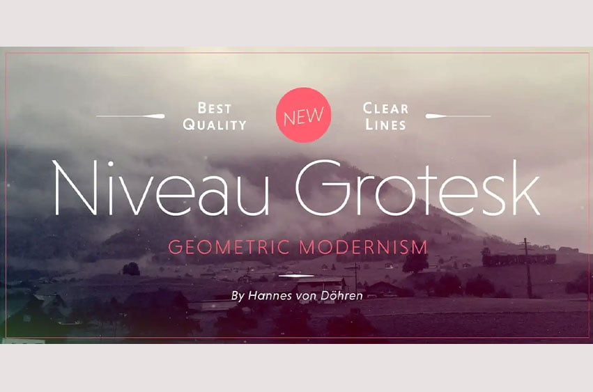
Niveau Grotesk Font the companion of Niveau sans-serif is a type family of six weights plus matching italics and small caps. It was designed by Hannes von Döhren in 2013. Influenced by classical nineteenth-century faces, the fonts are based on geometric forms. Because of its straight architecture, Niveau Grotesk has a “punch” in big sizes but is very legible in smaller sizes and longer texts—in print or on screen.
Niveau Grotesk Font Preview


Personal Use Only
Try Niveau Grotesk
Type your own text to see how it looks before you download.
The quick brown fox jumps over the lazy dog
Leave a Reply