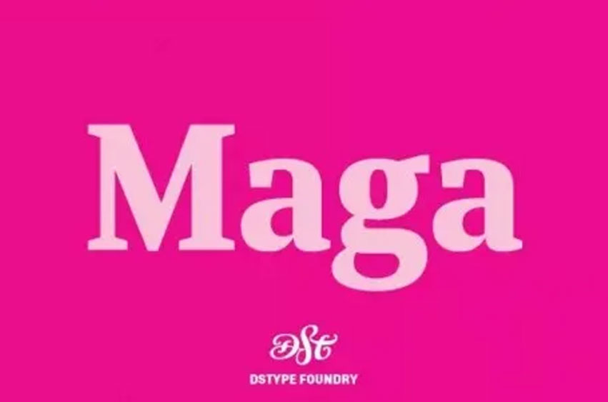
Maga Font Family, shares the skeleton with one of our first typefaces (Quaestor, from 2004), but we didn’t want to simply expand an existent design, so we took a step forward—not just with improved features and new weights, but also making the italics more usable than its predecessor.
The balance between the counters and the space between letters makes this a very space-saving typeface with plenty of legibility, yet stylish enough for contemporary magazine design.
Maga Font Preview


Personal Use Only




Leave a Reply