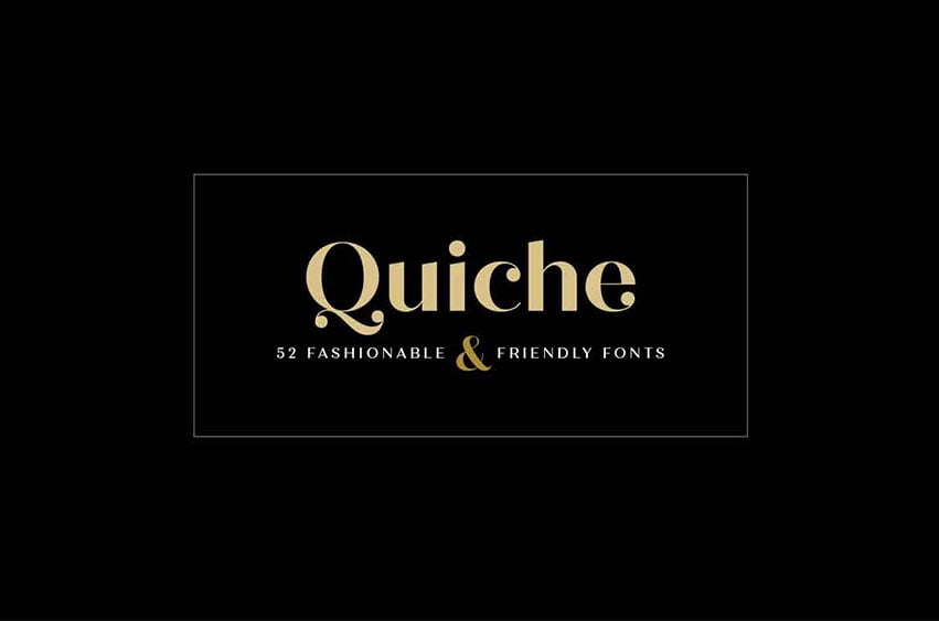
Quiche Font Family is a high-contrast, sans serif typeface featuring ball terminals and angled stems. This 52 font superfamily is a complete branding suite. The 4 subfamilies—Display, Fine, Stencil, and Text—were created to work harmoniously together based on the need. With weights ranging from thin to black and matching italics, there are a variety of applications that the fonts can be used for: print, web, branding, advertising, magazines, products, packaging, labels, etc.
The design is influenced by the serif didone genre, characterized by its elegance and extreme thick/thins, but it removes the serifs for a unique and modern expression. The high-contrast style exudes sophistication, while the ball terminals balance it by softening the overall look to make it feel a little more approachable.
For large type settings, like headlines and titles, use Quiche Display, Fine, or Stencil. The Fine styles have the highest contrast, so their beauty shines at really large sizes. For smaller type settings, like body copy and decks, use Quiche Text. It has less contrast and looser character spacing, making it a better reading experience at these sizes.
Quiche has many OpenType features, including: stylistic alternates, swash capitals, ligatures, small caps (Text styles only), fractions, subscripts, and superscripts. This font has extensive Latin language support for Western, Central, and South Eastern European.
Quiche Font Family Preview




Leave a Reply