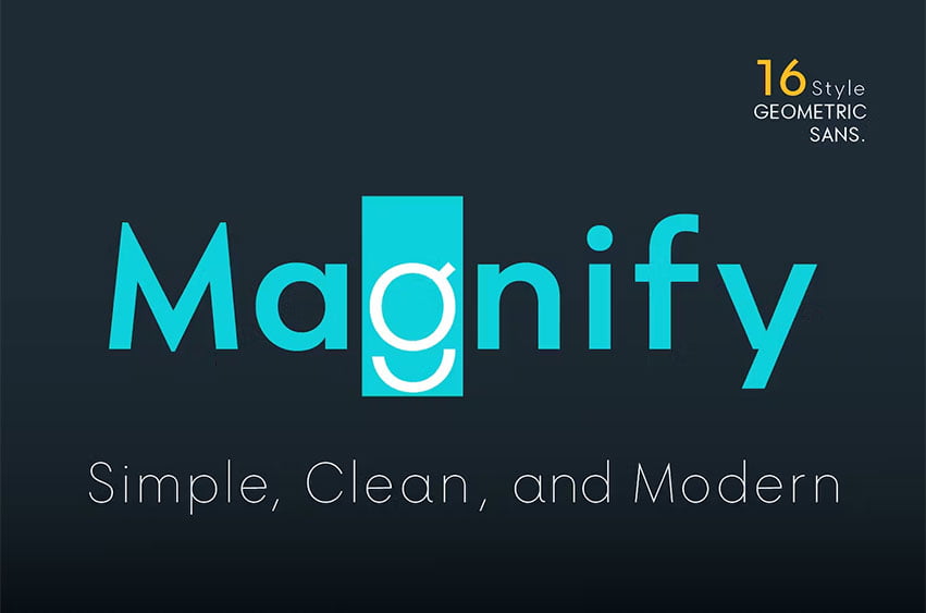
Magnify Font About This Font Family Geometric sans serif is one of my favorite fonts because it’s so, simple, clean and modern, and a long time I’ve been dreaming of making this type, inspired by many media and especially “Futura, 1927” ( by Early Bauer) I created “Magnify” Geometric sans. The structure and element shape of Magnify is not really perfectly circle, but slightly oval it can be seen in the uppercase letters O, G, C, Q and in the lowercase letters o, a, c, e.
Magnify has 8 weights, – from Hairline to Bold and Matching Oblique.
Magnify also has special alternate characters in letters a, g, y and o. it is to give a different look to a paragraph, headline or your display design.
thanks, hope you would like and accept “Magnify” as part of your family.
thank you in advance
Magnify Font Preview


Leave a Reply