Lyon Font Khajag Apelian and Wael Morcos designed Lyon Arabic text to be a companion to Kai Bernau’s original design, translating the Naskh script characteristics to a typographic context, making it ideal for long passages of texts in books and editorial design. Like the Latin, the design of the Arabic maintains simplified constructions and embraces straight-forward detailing with a visible digital touch, making for a crisp texture and a robust appearance comfortable for reading at small sizes.
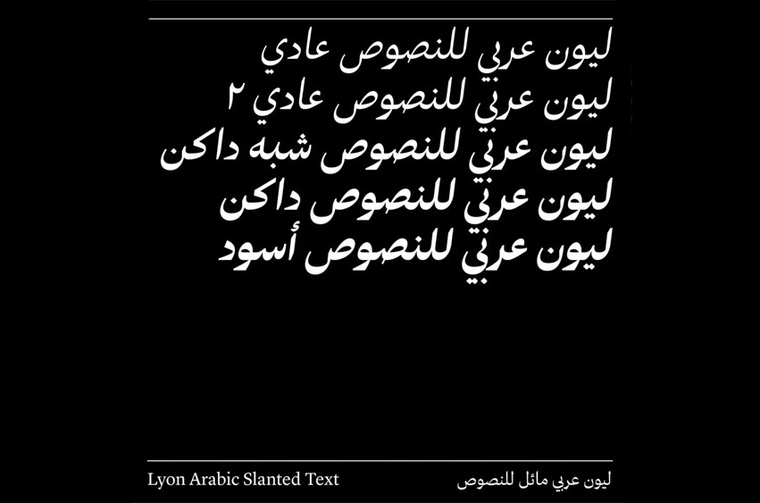
Lyon Arabic Slanted is designed to convey a different texture from Lyon Arabic, using the Nastaliq script as a model in order to bring fluidity and angle to the design. The two families, each with their own distinct flavor, can be used on their own, for content differentiation within one layout, or even mixed for in-line emphasis.
Lyon Font Preview




Leave a Reply