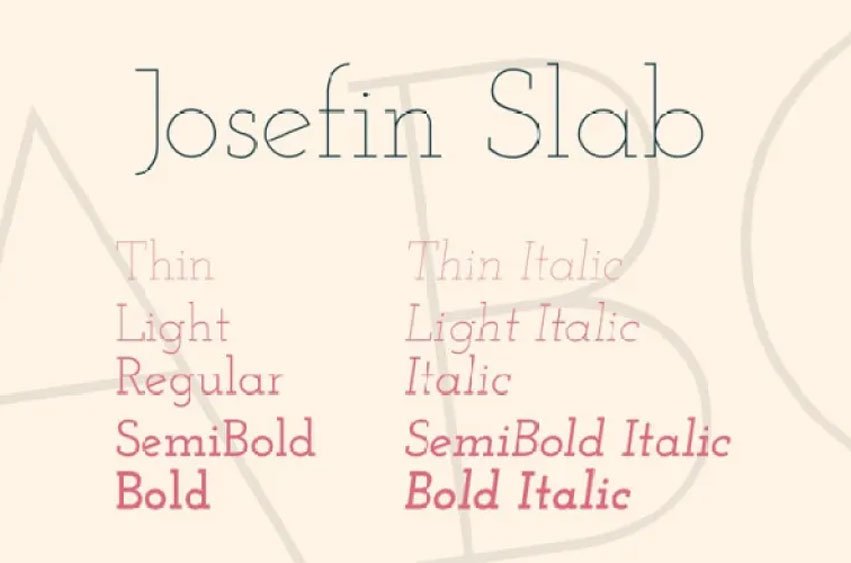
Josefin Slab Font was the first typeface I designed, at least in my mind! However, I thought it best to begin by choosing a font that was basic and could be easily edited, so I chose Josefin Sans. Staying within the 1930s geometric style typefaces, it suddenly dawned on me that something in between Kabel and Memphis with a few modern touches will do the job.
I decided to stay with the concept of Scandinavian style, that is why I paid much attention to diacritics especially to symbol ‘æ’ which is connected by the circles so the slope of the ‘e’ was decided by this symbol.
It also has some typewriter style attributes because I have always loved the letter gothic typeface since high school and so I thought of creating a slab version for the Josefin Sans.


Leave a Reply