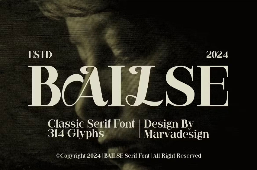
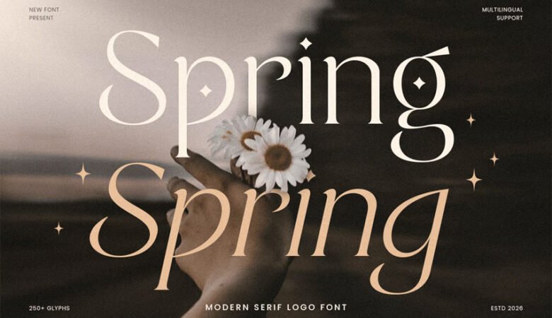
Bailse Font Serif tend to have fine serif details and well-proportioned proportions. Subtle serif details provide a classic touch without overly framing it. The balanced and proportional proportions of the characters create a neat and orderly impression. Moderate letter height ensures good readability without sacrificing aesthetics. The character can have a slight curve to add softness to the overall look. This font is suitable for use in titles, main text, or other large text in designs that prioritize a formal and classic impression.
Bold Decorative Font with a Relaxed Feel
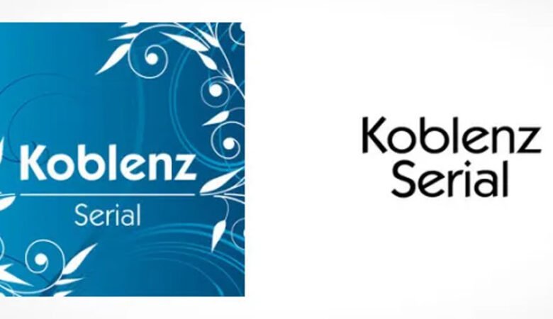
Bold decorative fonts with a relaxed feel feature strong boldness, providing clarity and boldness in the message they want to convey. However, the character’s style still gives a relaxed and friendly impression. There may be decorative details inspired by nature or other organic elements, such as leaf elements, flowers, or shapes inspired by the everyday environment. This adds warmth and playfulness to the overall design. This font can be used to highlight important elements, make a strong statement, or add an interesting accent to an overall design.
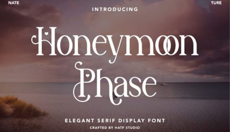
By combining these two font types, you can create an interesting contrast between the elegance of an elegant serif and the relaxed boldness of a decorative font, creating a design that is unique, elegant, and eye-catching.
availlable
- otf
- ttf
- Uppercase
- Lowercase
- Multilingual
- Alternate
Bailse Font Preview




Leave a Reply